|
|
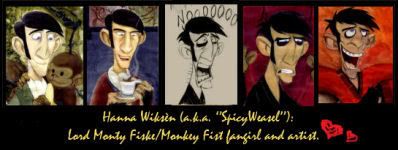
Post by SpicyWeasel on May 10, 2007 11:56:23 GMT -5
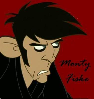
More Monty fanart. Monty Fiske Situation Drawings (in pencil)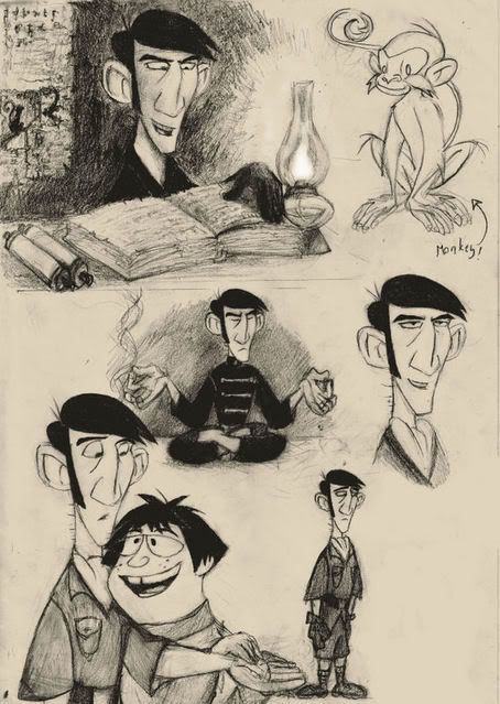 I just think it's fun trying to figure out Monty's past. I especially find the whole radical genetic mutation and dangerous experimental surgery-thing interesting. I know it's wrongsick. I know. But It's oddly interesting! I've always had a thing for scary, creepy and freaky stuff. So I drew Monty together with DNAmy....you know the rest. I really didn't want to draw her, but she is the geneticist who gave him his monkey hands and feet... so she's an important character in Monty's life story. I would love to do some more situations from that part. I ALMOST drew Monty's ever-loyal butler Bates...but I just didn't. I went all lazy at the end. So that's why it's an open space on the right to Monty (see the last drawing, bottom hand right corner). I'm not satisfied with the drawings...but I rarely am. I have an annoying need to get everything ''perfect''. However, It's not a goal to capture the show's style, or Stephen Silver's fluid, clean pencil lines. No way! My artwork is messy and not clean at all. I just want to get the characters (not the style!) as close to the original as I can, and capture their personalities and behavior. *Many people have trouble with drawing hands. So have I. It IS very difficult. I'm usually too tired at the end to put much effort into that body part. Sorry about the horrible hand poses. Monkey Fist...again Errr...nothing special. Lack of good ideas. Paintshop Pro 9. More character sketches and paintings to come. |
|
|
|
Post by VICIOUS on May 10, 2007 12:01:35 GMT -5
|
|
|
|
Post by Jessica on May 10, 2007 14:47:37 GMT -5
Great!
|
|
|
|
Post by Lord FunkyHoof on May 10, 2007 15:50:16 GMT -5
Wow those are awesome!
|
|
|
|
Post by Nueva Paz on May 10, 2007 21:27:09 GMT -5
Dude. o-o;
These are frickin' awesome. What media are you using?
|
|
|
|
Post by SpicyWeasel on May 11, 2007 0:48:48 GMT -5
Traditional media: Pencils (HB and 2B to 6B), acrylics paint, watercolor-and colored pencils.
Digital media: Paintshop Pro 9 (coloring, effects, brightness and contrast, etc.)
By the way...I totally love your avatar. I saved it to my animations collection!
|
|
|
|
Post by Nueva Paz on May 11, 2007 1:11:45 GMT -5
Sweet. I thought the one at the top of this page was charcoal or something...
And thanks. X3 I actually got it from Zeki.
|
|
|
|
Post by nabusan on May 11, 2007 7:39:18 GMT -5
My jaw fell open when I saw this new pic! It's so on model! And I absolutely love the texture/color of the paper you do it on and the material you use!
Which pencils do you like using best out of the ones you listed?!
|
|
|
|
Post by SpicyWeasel on May 11, 2007 7:57:30 GMT -5
Hmmm...I like HB and 2B, because they're not so soft and do not mess everything up. But 6B is needed for the darkest shadows and other parts, such as Monty's hair. It's nothing ''magical'' with the paper I use, but it looks horrible after the scanning, so a quick fix and clean up process in Paintshop Pro 9 is important for better quality. I use ''brightness and contrast'' (adjust). As for effects, I like using ''aged newspaper'' or ''sepia toning'' to make the paper a little more comfortable and harmonic for the eyes.
Thanks for commenting on everything, nabu! It really means a lot. And this thread will be updated every time I make new stuff. So more to come!
|
|
Arreth
Yellow Trout
 Undisputed Proof of Bon Diggity Dancing!
Posts: 42
|
Post by Arreth on May 11, 2007 21:15:03 GMT -5
Awesome job! Skills!
|
|
|
|
Post by drakkenfan on May 11, 2007 23:28:41 GMT -5
I love the new drawings!  |
|
Bring
Yellow Trout
Posts: 70
|
Post by Bring on May 12, 2007 3:11:47 GMT -5
Wow, this is some seriously good stuff. I love how you convey the facial expressions quite well and honestly, your proportions aren't that bad. As a fellow future animator in art school, I know what you mean when you say you re never satisfied with your work but that is a good sign. It means you won't stop drawing. Your hands will get better as you keep drawing, its a big issue for everyone. You should see some of the creative ways ppl in the animation department hide their hands and feet (and make figures with blank heads). As for the practice on human figures, you could attend figure drawing sessions or get a figure drawing book and trace the pages. Tracing helps alot, infact I might be tracing a book right now as I write this message. But let me just say that I think your drawings kick the crap out of mine. Anyway, keep up the good work, can't wait for the next set of drawings.
|
|
|
|
Post by DanMat6288 on May 12, 2007 13:14:17 GMT -5
Actually, I do draw a lot of people where their hands are either in their pocket(s) or behind their back.
|
|
|
|
Post by unferthidol on May 12, 2007 21:14:59 GMT -5
These are really fun and expressive, especially the paintings. (Though I like the sketches the best cos I'm a prelim whore. ) You keep Monty looking pretty handsome, especially in the fourth one from the left in the second row.
|
|
|
|
Post by seradarkness on May 13, 2007 15:10:40 GMT -5
Wow... I must say that these are some of the best Monkey Fist/Monty Fisk drawings that I have ever seen! They look so close to the show's animation that it's uncanny. I especially like the situational pic at the top of this page. The pictures there are just... wow. I look forward to seeing more of your work. |
|
|
|
Post by SpicyWeasel on May 15, 2007 15:30:27 GMT -5
A bunch of acrylics paintings!Rage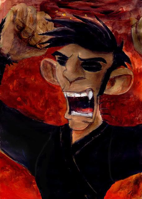 I love the idea, the colors and the volume effect with lights and shadows in Monty's face. I used to hate it because I drew Monty's fist(s) too big. Not monkey fists...but gorilla fists! Seriously. But I tried to fix it in PP9....using the Clone Brush tool. So if the acrylics/colored pencil texture doesn't seem quite right...that's why. It looks a tad better now, and I'm glad I managed to save it. Blue Moment with Monkey NinjasEarlier title :Frustration/anger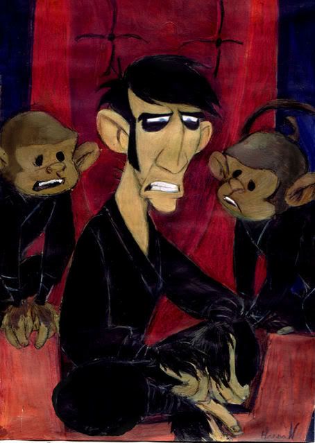 Monty is something in between Monty Fiske and Monkey Fist here. I've been speculating a lot around Monty and the MMP transformation/change: ronstoppable.proboards89.com/index.cgi?board=villains&action=display&thread=1121286091&page=4 (first post on the page) ... I don't like how the monkeys came out. >___< And here's another one of Monty Fiske: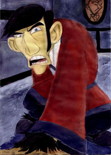 I tend to jump into difficult angles and twisted poses, just because I want to(sigh...WHY?). The angle is supposed to be exaggerated, but I still need to practice exaggeration more. I can't do it right for a cookie....yet. Some proportion mistakes, I think. Brrr...I really didn't want to post it!  Honestly...I prefer to work with pencils.
|
|
|
|
Post by seradarkness on May 15, 2007 15:37:36 GMT -5
Those are really good! I love the way you draw and paint! It's really neat and professional. I especially like the second one, although I would say that Monkey Fist looks more sad than angry. I especially like the look of him and the monkey behind him though. The monkey looks like Chippy!  |
|
|
|
Post by SpicyWeasel on May 15, 2007 15:49:46 GMT -5
Yes, the first title I came up with was actually 'Blue Moment with Monkey Ninjas'.There! Modified!  Thanks a lot for commenting, fellow fan of Monty Fiske/Monkey Fist! |
|
|
|
Post by Lord FunkyHoof on May 15, 2007 18:57:42 GMT -5
Good work as always, they look really nice!
|
|
|
|
Post by Nueva Paz on May 16, 2007 0:34:57 GMT -5
Aww, he looks so sad in the second one.
I just love the painterly look of these. I really like the background in the "Rage" one. I can't think of whose style these remind me of...
|
|